MaskSense Brand Identity Design
Scope: Logo, Supporting Graphic Elements, Brand Guide
Role: Research, Design
The MaskSense brand identity was designed to visually reinforce the company's mission—transforming mask-wearing into a more pleasant and uplifting experience. I was provided with a foundational brand strategy document outlining key goals: to shift attitudes, behaviors, and overall perceptions of wearing a mask in a positive way. My task was to translate these guiding principles into a compelling and cohesive visual identity.
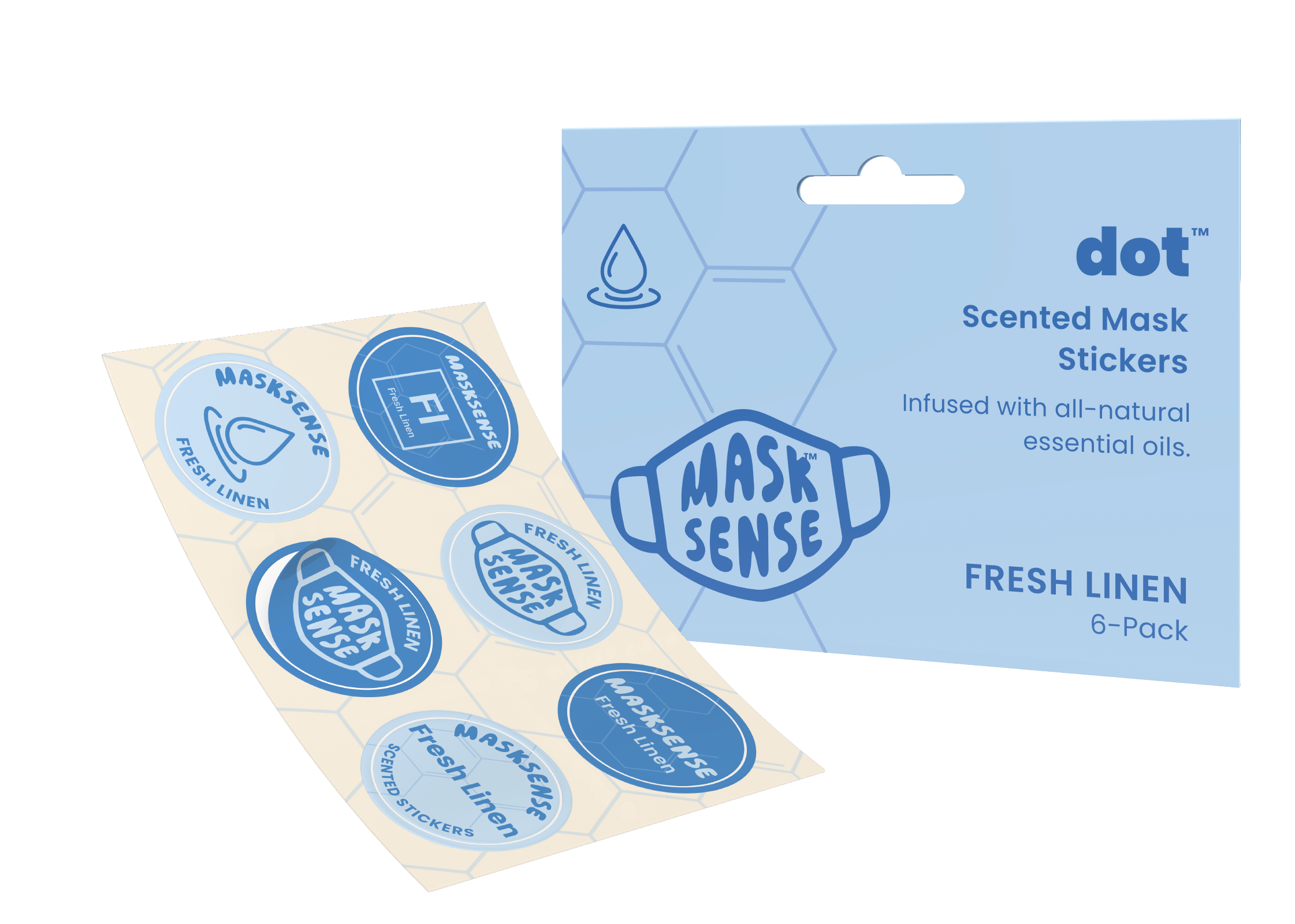
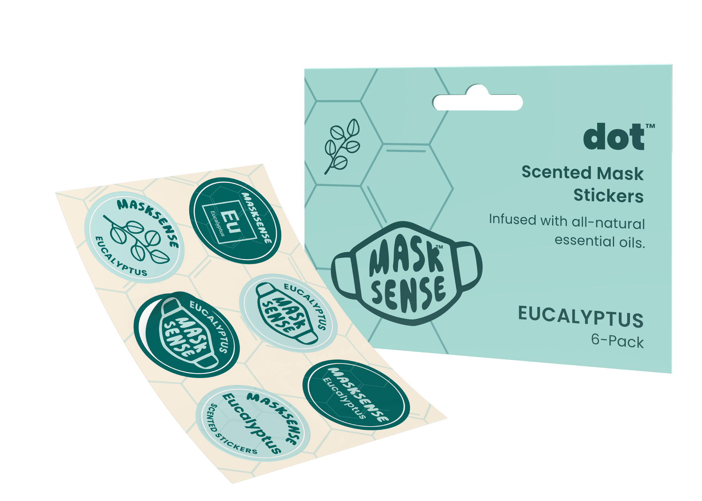
I began by developing a bold, recognizable logo that encapsulates the product’s application—featuring a strong mask outline with the brand name integrated within. Unlike traditional accessories, mask-related products were not widely recognized before the COVID-19 pandemic, making it essential to create a distinctive and memorable mark. Additionally, because the product itself is hidden from view when in use, the visual identity needed to communicate the sensory and emotional benefits of MaskSense without direct product visibility.
Supporting graphic elements play a crucial role in conveying the brand’s essence. Swirling, vibrant colors combined with illustrations representing the natural origins of each essential oil-based scent evoke the mood-boosting effects of aromatherapy. Molecular-inspired patterns and a playful "periodic table" system for scent labels highlight the scientific foundation of the product—developed by physicians with fragrances crafted by a master aromatherapist.
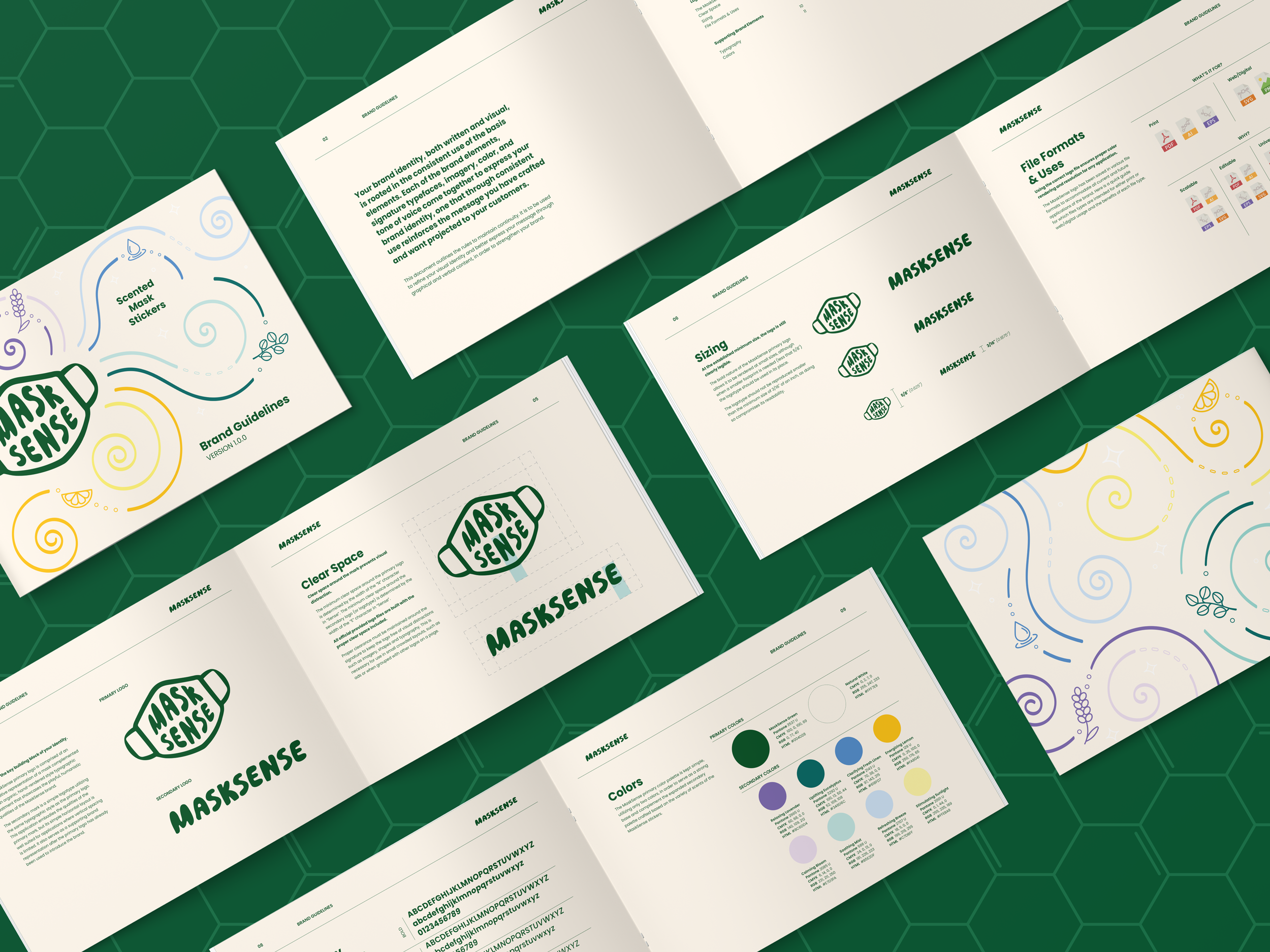
The resulting brand identity is dynamic, approachable, and infinitely scalable, ensuring a seamless expansion as new scents and products are introduced in the future.